
Pivot Table
A pivot table is a table of statistics that summarizes the data of a more extensive table. This summary might include sums, averages, or other statistics, which the pivot table groups together in a meaningful way.
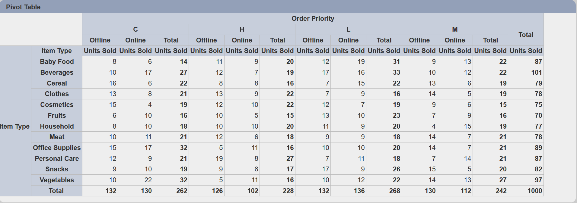
The following is a list of the fields in the View Properties box in the dashboard designer for pivot table. There are some required fields to be set for each created view.
Basic Properties
The View Properties fields vary in different charts. Below are the basic properties in the View Properties box.
| Field | Description | Mandatory |
|---|---|---|
| View Type | Type of chart, table or view. | Yes |
| Title | Name of the view. | No |
| Dataset | Data used for the chart, table or view. | Yes |
| Subset | Partial data from a dataset used for the chart, table or view. | No |
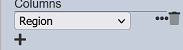
| Columns | Defines the fields for the columns and their labels. More than one field can be added. |
Yes |
| Rows | Defines the fields for the rows and their labels. More than one field can be added. |
Yes |
| Measures | Defines the field as the values in the cells and their properties. More than one field can be added. |
Yes |
The dataset and subset data derive from Datasets module. Choose the right chart from the View Type and data points to build a view.
Other Properties
The other property fields are available to enhance the view. Below are the other properties in the View Properties box for the pivot table.
| Field | Description | Default |
|---|---|---|
| Controlled By | Links dashboard controls to the view. One or more controls can be added to affect the data displayed on the view. |
Empty |
| Select to Control | Allows a selection made in the view to set the value of a control. Other views which are dependent on that control will then update accordingly. | Empty |
| Expand | If selected, expands all rows and columns (if more than one row and/or columns are defined). | Selected |
| Collapse Single Totals | If selected, removes total column from table if there exist only one value column. | Selected |
| Column Options | Allows show or hide root and totals in the columns, as well as renaming root and total. | Default settings |
| Row Options | Allows show or hide labels, root and totals in the rows, as well as renaming root and total. | Default settings |
| Measures Vertical | If selected, the “Measures” property labels are displayed vertically. By default, the labels are displayed horizontally. |
Not selected |
| Show Measure Labels | If selected, displays the name of the field selected in “Measures” property. | Selected |
| Show Export XLSX | If selected, displays the export XLSX icon on the top left of the view. | Not selected |
| Maximisable | If selected, places a maximise button on the top right of the view (when not in edit mode). This will maximise the view to fill the browser. |
Not selected |
| Advanced | Add a special CSS class to your view. | Empty |
Example 1: Using “Measures” Property
You can use the “Measures” property to choose the type of information to be displayed in the table cell.
In the “Measures” property, click on the  “Properties” icon next to the desired field to display the “Measure Properties” dialog box.
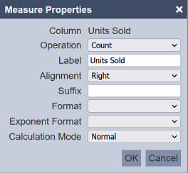
You can customise and select different types of operation in the dialog box. The table below summarises the usage on the fields in the dialog box.
| Field | Description | Default |
|---|---|---|
| Operation | Types of operation. The options are count, sum, average, minimum and maximum. |
Count |
| Label | Name of the measure. By default, it is undefined (empty), therefore the name of the selected field is used. |
Empty |
| Alignment | Alignment of the value. The options are left, centre and right. |
Right |
| Suffix | Defines the suffix to be added to the value. For example, the dollar sign $. |
Empty |
| Format | Selects the format of the value. For example, if the value is currency, select 0.00. |
Empty |
| Exponent Format | Selects the exponent format of the value. The options are exponent, SI and B. |
Empty |
| Calculation Mode | Defines the calculation mode of the value. The options are normal, ratio of row and ratio of column. |
Normal |
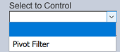
Example 2: Using “Select to Control”
In the pivot table, you can select “Pivot Filter” in the “Select to Control” property to control the content of other views.
In this example, a pivot table and a linear table is created. Both uses the same dataset. Create the “Pivot Filter” to use the same dataset. In the pivot table, select the “Pivot Filter” in the “Select to Control” property.
In the linear table, select the same filter in the “Controlled By” property. This will allow the pivot table to control the data to be displayed in the linear table.
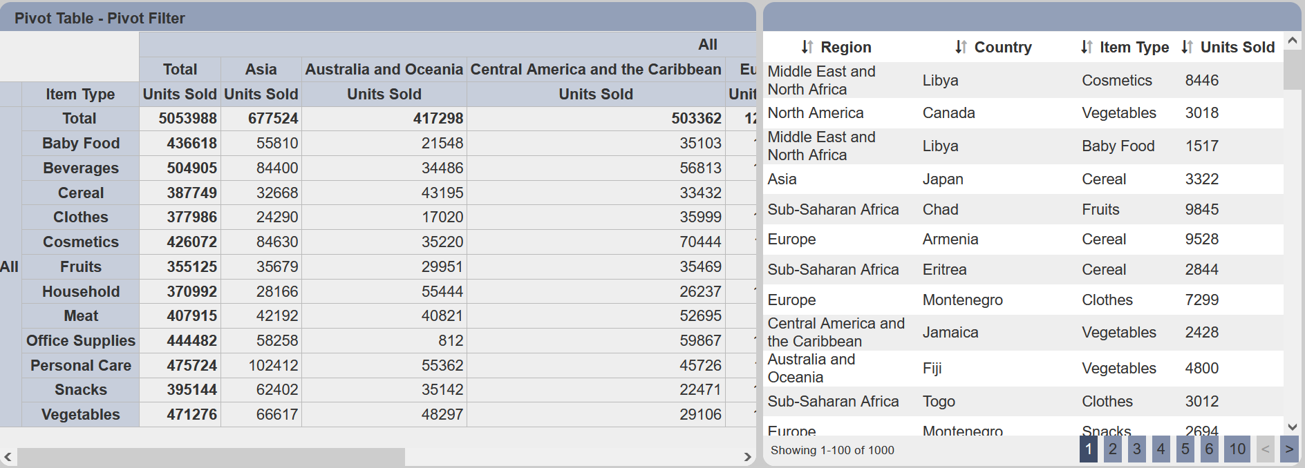
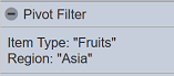
Select any value in the cell in the pivot table. In this example, “Fruits” and “Asia” is selected. If the “Visibility” property in the “Pivot Filter” is set to “Always”, you will see your selection in the Filter Control Panel.
At the same time, the header row of the pivot table displays the selected item and the linear table now shows only the items from “Asia” and “Fruits”.
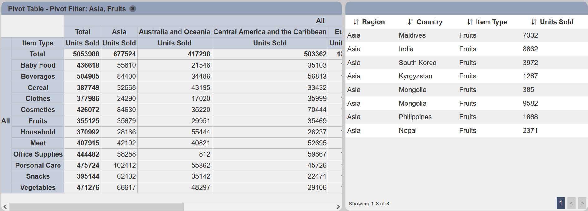
To reset the selection, click on the  “Close” icon on the header row.
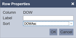
Example 2: Using Sort Field in Rows and Columns Properties
The rows and columns of the pivot table is by default listed according to the order in the dataset, which can be difficult to read at times. You can sort the rows and/or columns of the table by using the “Sort” field in their properties.
In the example below, the “DOW” rows are not sorted according to days which make it hard to read.
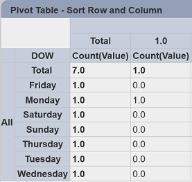
To sort the days, in the Row Properties, select a field that corresponds 1:1 to the “DOW” field. In this case, “DOWAsc” is selected to sort the days from “Monday” to “Sunday”.
Click on the “OK” button to save the change. The table is now sorted according to days, which is easier to read.
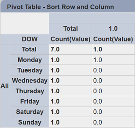
The columns can be sorted in the same manner as well.