
Circular Gauge
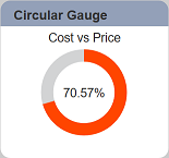
A circular gauge is used to display a value as an angle on a circle plot
The following is a list of the fields in the View Properties box in the dashboard designer for circular gauge. There are some required fields to be set for each created view.
Basic Properties
The View Properties fields vary in different charts. Below are the basic properties in the View Properties box.
| Field | Description | Mandatory |
|---|---|---|
| View Type | Type of chart, table or view. | Yes |
| Title | Name of the view. | No |
| Dataset | Data used for the chart, table or view. | Yes |
| Subset | Partial data from a dataset used for the chart, table or view. | No |
| Value | Used as the value to be compared with Total field. | Yes |
| Value Aggregation | Value aggregation refers to the accumulation of the data for Value field by count, average, or summation. By default, count is selected. |
Yes |
| Total | Used as the value to be compared with Value field. | Yes |
| Total Aggregation | Data aggregation refers to the accumulation of the data for Total field by count, average, or summation. By default, count is selected. |
Yes |
The dataset and subset data derive from Datasets module. Choose the right chart from the View Type and data points to build a view.
Other Properties
The other property fields are available to enhance the view. Below are the other properties in the View Properties box for the circular gauge.
| Field | Description | Default |
|---|---|---|
| Controlled By | Links dashboard controls to the view. One or more controls can be added to affect the data displayed on the view. |
Empty |
| Show Percent | If selected, shows the label at the centre of the view in percentage. | Selected |
| Stroke | Defines the thickness of the circular gauge. | 15 |
| Colour Scale | Defines different colour at different percentage point of the gauge. By default, 3 levels are defined: - <50%, Red - <75%, Orange - Undefined, Green More can be defined. |
Varies |
| Text | Defines the label at the centre of the view, including prefix, suffix and font size. | Default settings |
| Sub Text | Adds a label in the view and defines its location, padding and font size. | Empty |
| Click to Page | Adds a link to another view. | Empty |
| Click to Page Tip | Adds a brief description of the link above. | Empty |
| Maximisable | If selected, places a maximise button on the top right of the view (when not in edit mode). This will maximise the view to fill the browser. |
Not selected |
| Margins | Allows adjusting margins and padding between charts and grid. | Default settings |
| Advanced | Add a special CSS class to the view. | Empty |