Bar Chart / Bar Percent Chart
A bar chart is a chart that presents categorical data with rectangular bars with heights or lengths proportional to the values that they represent.
The following is a list of the fields in the View Properties box in the dashboard designer. There are some required fields to be set for each created view.
Basic Properties
The View Properties fields vary in different charts. Below are the basic properties in the View Properties box.
| Field | Description | Mandatory |
|---|---|---|
| View Type | Type of chart, table or view. | Yes |
| Title | Name of the view. | No |
| Dataset | The data used for the chart, table or view. | Yes |
| Subset | Partial data from a dataset used for the chart, table or view. | Yes |
| X and Y Values, Key and Value | The X and Y values set on the X-Axis and Y-Axis. The Key and Value on the Pie Chart. | Yes |
| Sort X | It sorts the X-Axis, for example, sorting weekdays in the chart. | No |
The dataset and subset data derive from Datasets module. Choose the right chart from the View Type and data points to build a view. Also, be consistent in using the color scheme and formatting.
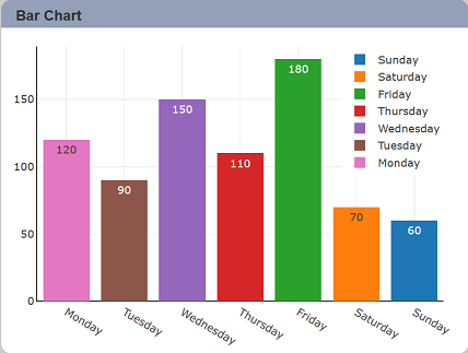
Sample 1: Using the Sort X
A good scenario of using the Sort X is when you want to re-ordering the X-Axis values, for example, sorting the weekdays. In the line chart below, the X-Axis values sorted by alphabetical. However, weekdays should be sorted by Monday, Tuesday, etc.

To re-order the weekdays’ values in the X-axis, this dataset applies a field called DOWAsc in the “Sort X” option. To descending sort, use the DOWDesc field.

Save the setting and the below line chart sorts from Monday to Sunday.
Aggregation
| Field | Description | Mandatory |
|---|---|---|
| Group | An option to arrange identical data in groups. For example, if a particular column has the same values in different rows, then it will arrange these rows in a group. | No |
| Aggregation | Data aggregation refers to the accumulation of the data by count, average, or summation. | Yes |
Color Formatting, Legend, Margin and Axis Properties
View Properties provides you with full control of how your dashboard appears. You can change the color of the charts, legend orientation, margin, and change how you want to present the X-axis and Y-axis.
You can change color schema by selecting the color from the dropdown selection. It is advisable to keep the color scheme consistent throughout the entire dashboard pages.
You can choose the chart legend visibility in the Legend properties as well as how you want to display the legend. The legend orientation displays either in vertical or horizontal order.
The X-Axis and Y-Axis properties edit the setting such as title, show grid, and tick format. Lastly, edit the bar chart canvas margin and padding by navigating and expanding the Margin properties.
| Field | Description | Mandatory |
|---|---|---|
| Legend | Choose the chart legend visibility in the Legend properties as well as how you want to display the legend. The legend orientation displays either in vertical or horizontal order. | No |
| Flip Axes | Transpose the X and Y axes. | No |
| Color Scheme | The color scheme of a view. The default color scheme is selected. | No |
| Margins | It controls the spacing between the chart and the edge of the canvas. | No |
| X-Axis, Y-Axis | It controls the axis’ title, visibility, formatting, show grid or line. | Yes |
| Maximisable | Put a Maximise button on the top right of the view (when not in edit mode) and this will maximize the view to fill the browser. | No |
| Advanced | Add special CSS class, data script and/or layout overview to the view. | No |
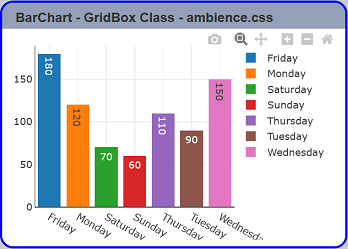
Sample 2: Using the Advanced properties to add a special CSS class.
Expand the Advanced properties from the View Properties box; you see a GridBox Class, Data Script, and Layout Override fields. The GridBox class allows you to add a special CSS class to your view. For example, if you want one view to have a different background colour, you might add to ambience.css. You may locate the ambience.css file at ./web/style/folder.
.my-custom-view {
  border: 3px solid blue !important;
}
Next, set the GridBox class to my-custom-view. Using the bar chart created earlier, apply the above steps. The expected output after refreshing the Dashboard Page as below.
Optional Properties
| Field | Description |
|---|---|
| Controlled By | Add or remove the filtering controls on the view. |
| Sort Group Pattern | Defines the field to sort the “Group” field. |
| Extra Lines | Add an extra line into a view that takes a field from the dataset and applies the sum, average, or count operation on that field. The result of the operation displays in the view with a line that defined in the properties setting. |
| Drill | Allows drilling down data on the selected group level. |
| Select to Control | Allows a selection made in the view to set the value of a control. Other views which are dependent on that control will then update accordingly. |
| Bar Mode | Determines the bar mode. The options are group, stack and relative. |
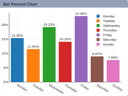
| Bar Normalisation | Determines the bar normalisation. The options are none, percent and fraction. |
| Text Position | Determines the position of the text to be shown in the view. |
| Text Format | Determines the format of the text to be shown in the view. |
| Fonts | Determines the size of text on the inside and outside of the bars. |
| Hover Template | Customise the content shown when hovering over the view. |
| Click to Page | Link a view to another dashboard page. |
| Click to Page Tip | Adds a brief description of the link above. |
| Config Options | Config Options consists of the following: - Scroll Zoom - allows the mouse wheel to zoom in/out of the chart - Display Modebar - controls whether the bar of icons at the top right of the chart should appear always, never or only when hovering over the chart - Hide Modebar buttons - chooses which buttons (icons) to include in the Modebar |
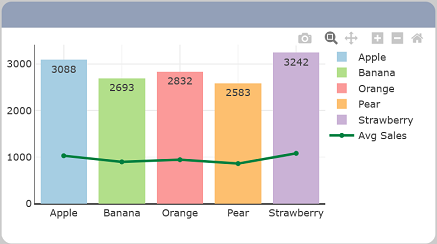
Sample 3: Using the Extra Lines In A Bar Chart.
Demonstration of the calculation of the average sales of the different categories of fruits by using the FruitsDemo dataset to display extra line in the view. The size represents the thickness of the line, by default, sets as 3. Give a unique name to show in the legend. Select the sales field and average operation from the dropdown list. As a result, a green line displays on the bar chart.
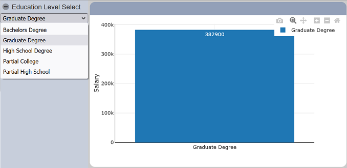
Sample 4: Using the Controlled By option on a view drilling down.
In the designer mode, select a view and open the “View Properties” to add a new control at the “Controlled By” option by clicking the “+” button. Save the setting.
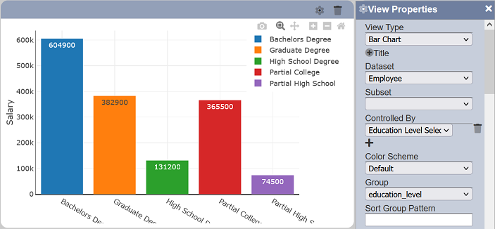
Back in the dashboard viewer, click on the “Open Filter Panel” to show education level selection control and choose any option from the list. You will notice the view changes accordingly. If you have more than one view using the same option control, those views will change too. The “Reset” button resets the view to its original.